Lately, I’ve been pouring through hundreds of print comics to catch up on stories, both old and new, that I feel I should read. While paging through these stories, I’ve seen a breadth of cover quality – everything from stuff that makes me stop and stare at the cover for a few minutes in awe to stuff that makes me stop and stare at the cover for minutes in horror. As I saw more and more covers, I started noticing a few trends in what made me think a cover was good versus what made me think it was terrible versus the least desirable result, a completely forgettable comic book cover. These are definitely not the only ways to make a cover attractive but at least it’s a place to start when developing the cover to a comic.
I will alternate between a few dos-and-do-nots but for the sake of keeping this blog reasonable in length, I will only use examples that I find pleasing and will ignore the bad covers. Keep in mind that it would be nearly impossible to do all of the following on one cover so maybe try to pick one or two that you can work with and go from there.
DO: Take a snapshot of the story.
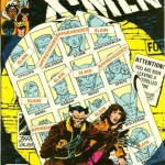
It doesn’t have to be 100% accurate with what happens in the book nor does it need to convey the entire issue’s story (though it can), but it should be a single moment of one of the most exciting parts of the issue itself. This will give the reader an idea of what to expect should he or she decide to read the comic. In my opinion, the best example of this is the legendary Uncanny X-Men#141 by the equally legendary John Byrne. What this cover represents is pretty mind-blowing once you look at it for a few minutes. Wolverine and Kitty Pryde are obviously on the run, though Wolverine is now… old? Okay, so it’s the future. Check. They are standing in front of a collection of wanted posters that show the reader how not only are mutants being killed but that they’re also being captured for some reason… why? Behind the poster, there is mention of a controlled zone. What the hell is going on in this book? With one image, John Byrne and Chris Clairemont created a bunch of questions, a little backstory, and a lot of intrigue. You create a cover like this and you’re going to sell a lot of comic books on it. Mind you, this scene never happens in the comic nor is there really anything close to it inside the book… but that’s okay. It’s a teaser poster that makes the reader want to know more and while the cover itself is not exactly re-created in the book, the overall feel of the cover is true to the interior contents. The X-Men are in serious trouble and many are dead. And that’s what matters to the reader.
DON’T: Show an image of your team standing there looking cool.
Nobody gives a shit, really. This cover has been done thousands of times and we’ve seen every hero/protagonist in every pose and nobody cares anymore. Unless you are an exceptional artist and people want to drool over anything you draw, this has zero appeal. Something to remember if you are that artist, though… if you’re that good, people will drool over anything you draw so draw something interesting, damn it. There is no excuse for softballing a shitty cover at your audience.
DO: Show your characters in jeopardy.
Everyone loves a cliffhanger and that’s exactly the role a cover plays for the interior of your book. “How was Superman bloodied and who did it?”, “Why is Batman tied up?” These questions create intrigue in a reader’s mind and make them want to learn more, hopefully by buying the book or at least flipping it open, which is the most important step of selling a comic. If you can’t get anyone to pick up the book, you’ll never sell a copy. While this is a great trick to get people to notice a book, do not cheat your reader and put something on the cover that has nothing to do with the story. We’ve all seen it and if you’re anything like me, it immediately fuels a righteous indignation for the creators of said comic book.
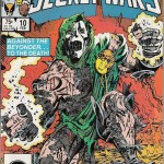
A perfect example of this is this Mike Zeck cover to Secret Wars #10 from the 1980s. When thinking about this blog, I immediately started searching for this cover because of the imprint it forever left in my ten year old brain. First, Doom is a badass. Second, someone tore him the &^%$ up. Third, I’m going to buy this book.
DON’T: Show a close-up of two characters posing or create a fake fight to garner interest.
We’ve all seen this on half the mainstream hero books printed by Marvel/DC. There are instances where something like this has worked (such as the Todd McFarlane issue of the Incredible Hulk where Hulk is reflected on Wolvie’s claws) but it’s a cheap way out. There are plenty of ways to show conflict within the confines of the story and there aren’t many reasons to use this tactic unless you’re going for a stylized cover approach, which brings me to the next point…
DO: Use appealing colors and a design sense to create a cover.
Half of a cover’s success is in its graphic design and you should have a fundamental understanding of layout, composition, fonts, etc. An artist should be able to convey his or her thoughts visually and in the case of a comic book, part of that conveyance involves accepting the sometimes intrusive elements of graphic design such as a title and credit fonts.
Use color, highlights, and shadow to your advantage. Make use of the title font or any other fonts on the cover and integrate them to give a cohesive feel to the cover. While there are a billion examples I could use for what I’m talking about here, I’m limiting myself to one; the cover to The Dark Knight Returns #1 by Frank Miller. It does everything right when it comes to design and is an early example of stepping outside the norm when it comes to cover design. In it, we have a dark blue background with a single bolt of (very nicely) rendered lightning descending through the cover. Even though we cannot see anything more than an outline, everyone can immediately identify the silhouette of Batman jumping through the air based on his spike ears, cape, and gauntlets. The title font is reserved and nicely proportioned to be a counter point to the leaping Batman. At the bottom of the page, the empty right hand space is nicely filled with the names of the creators. Outside of a blocky Batman font, all other fonts do a great job of getting the hell out of the way, letting the beautiful image take center stage. While your name, your studio, and all that other jazz is neat (and important) to you, remember that readers care about the characters. You’re not Joe Madureira so push your product on the cover, not yourself.
DON’T: Muddy up your cover with too many colors and things happening.
Every cover should have a clear focal point. In some cases, I’ve seen covers where the main characters are easily lost in a sea of… other stuff. It’s fine if your characters are fighting Galactus but how often does a cover need to show that kind of discrepancy in scale? Every cover should have one clear focal point, something that brings the reader’s eyes directly to a point on the page that you decide. Through the use of lines and colors, an artist has incredible control over how a reader’s eye flows over a piece of artwork. Use this to your advantage and force the readers to look at the part of the page you want them to see the most. Use of complementary colors, cool backgrounds, warm foregrounds, angling lines toward your focal point… there are many ways to accomplish this goal, you just need to think about it and implement what works best for your cover. This topic in itself could cover a series of blogs but if you’re lost on what to do, check out a photography book (or, if you’re looking to do some reading, a color theory & composition book). Remember that when it comes to color and composition, there is little difference between a comic book cover and a photograph. The rules that apply to one often apply to the other. If you’re doing a superhero book, check out Sports Illustrated. If you’re doing a teen drama, pick up one of those terrible, horrible women’s magazines and check out the ads. If you’re doing an emo book, go shoot yourself. Kidding (kind of). If you dig around, there are millions of celebrity, sports, and environment photographs that can give you inspiration for almost anything you can think to draw.
DO: Make something you would want to read.
This seems painfully obvious but after looking through some covers, I felt that it was worth pointing out. If you aren’t excited about the cover, how it looks, what is happening, and what it symbolizes, why should anyone else give a damn?
My covers are far from perfect but I put a lot of thought into each and every one of them. In the case of my first cover of Variables, I actually held up production of the book because I was so worried about what to do with the cover image. Each cover represents something from the book that I feel is important to the story and therefore, the reader. I take that slice of the story and then try to make the composition as interesting as possible using whatever tools I can. And, as always, I keep learning and I hope that each cover I complete is better than the last.
And that’s really all we can ask of ourselves.
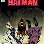
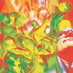
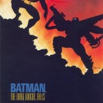
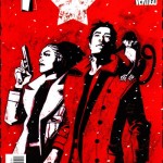
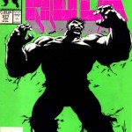
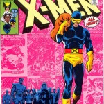
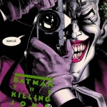
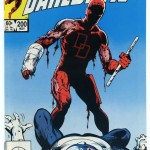
By the way, I pulled up dozens of images of covers that I feel are successful from a reader’s standpoint but I didn’t have room (or time) to talk about at length. Below, I’ve collected several of them for your enjoyment. Each image has at least one strong element I highlighted in the blog. You might notice that almost all of the covers listed are over ten years old. This is not an indictment of modern comic book covers, just a happy coincidence. There are dozens of great artists out there creating magnificent covers every day.
- Previous: Seven days late, but here it is…
- Next: More panel wonkiness


